Development of the visual identity for Berlin-based artist Shadore, spanning his debut EP "BUNT" and its follow-up NK Version. The project included creative direction, photography, cover design and a cohesive visual language across social media and promotional assets.
"BUNT" explores migration, belonging and the experience of everyday racism in Germany. The challenge was to create an identity that reflects these themes without reducing them to clichés or visualizing trauma.
My Role
Creative Direction Visual Identity Art Direction Photography Cover Design Social Media Design Campaign Assets
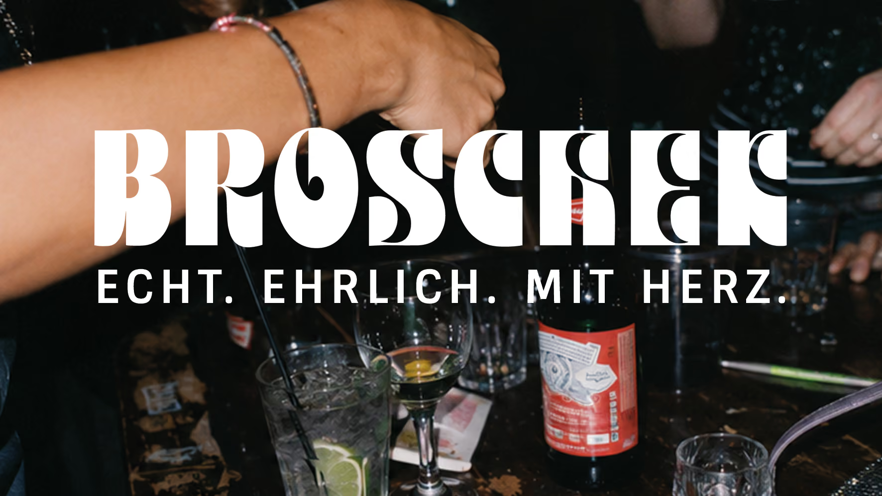
Developed a cross-channel brand identity for Berlin bar Broschek, including its visual identity, tone of voice, social media presence and a guerrilla out-of-home campaign. The goal was to translate the bar's unique atmosphere into a consistent brand experience and attract a younger audience without compromising its authenticity.
For over 18 years, Broschek has been a local institution between Sonnenallee and Karl-Marx-Straße. The challenge was to modernize its digital presence while preserving the warmth, character and sense of community that define the bar.
Rather than focusing on drinks, the brand celebrates the people who make the place what it is. Documentary-inspired Y2K photography, hand-drawn illustrations and an honest, conversational tone of voice create a recognizable identity across social media and out-of-home. The result is a brand that feels exactly like the bar itself: Echt. Ehrlich. Mit Herz!
My Role
Brand Strategy Brand Identity Creative Direction Art Direction Tone of Voice Social Media Strategy Content Concept PhotographyDirection Graphic Design Out-of-Home Campaign Design
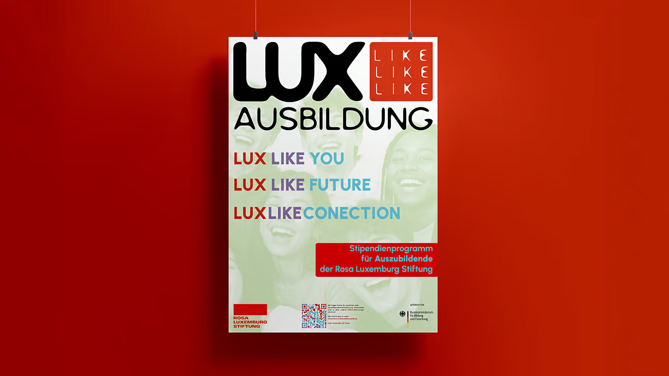
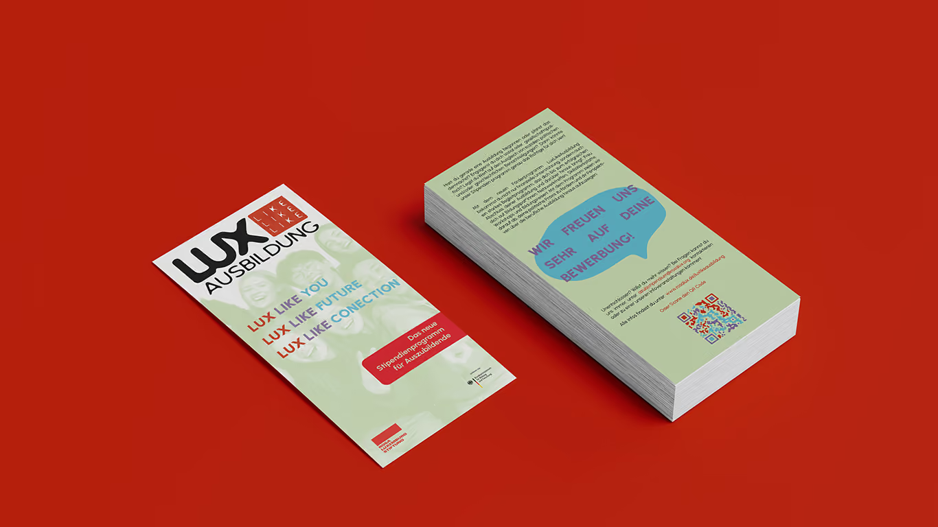
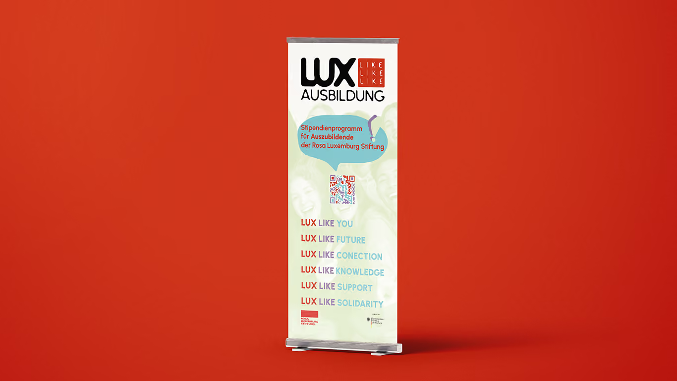
I created the visual identity and logo for LUX LIKE Ausbildung, a scholarship programme by the Rosa Luxemburg Foundation supporting vocational trainees across Germany. The goal was to develop a brand that feels credible and institutional while remaining approachable, optimistic and relevant to a younger audience.
Scholarship programmes are often associated with universities and communicate through formal, highly institutional design. This new programme needed to establish the same level of credibility while addressing apprentices—a target group that rarely sees itself reflected in this type of communication.
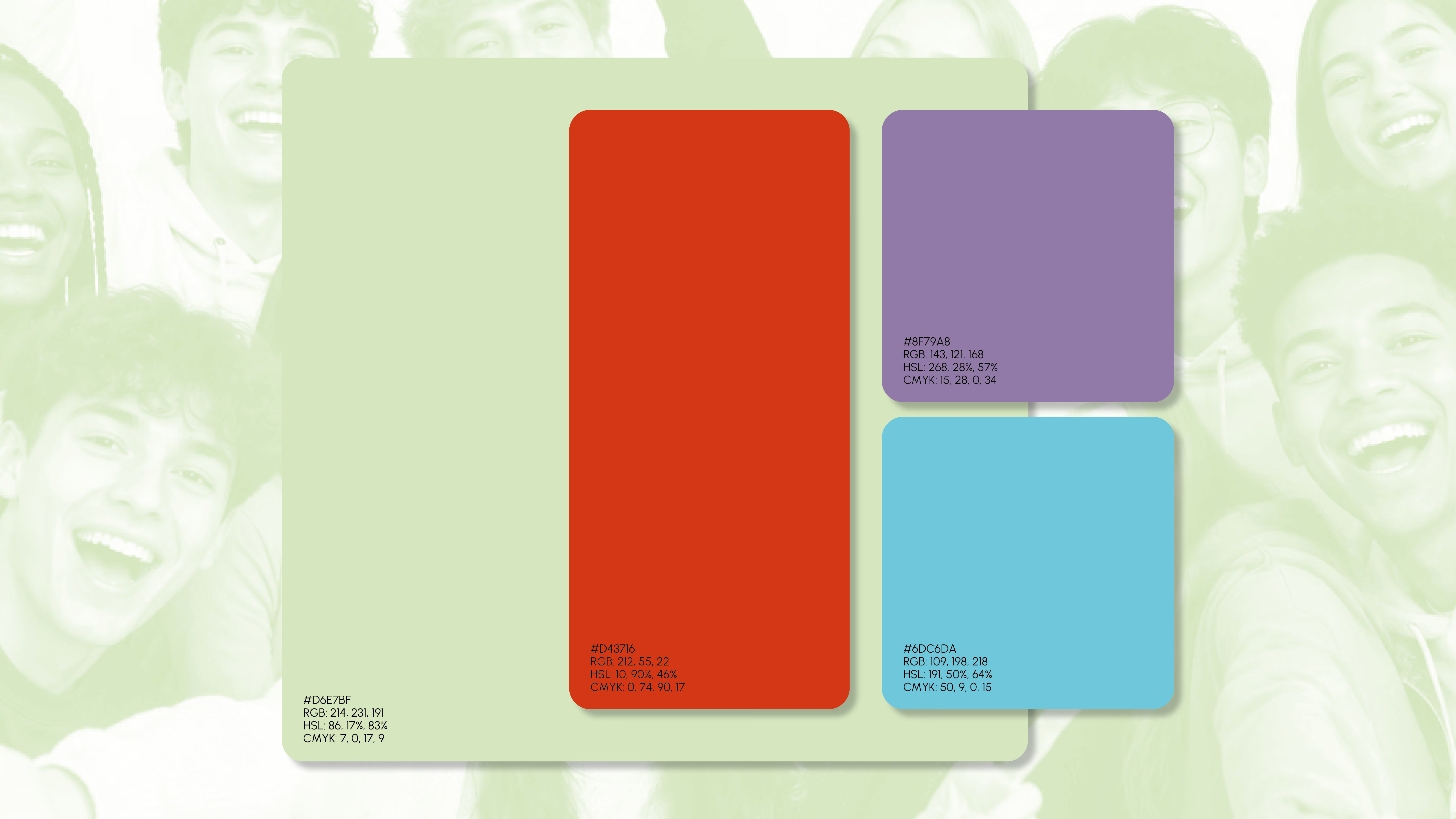
The identity balances institutional trust with accessibility. Instead of rejecting traditional educational aesthetics, I softened them through a warmer colour palette, approachable typography and imagery centred around community and optimism. The visual system positions vocational education on equal footing with higher education while making the programme feel more welcoming and easier to identify with. The identity was designed as a flexible system across print, digital and campaign media, creating a consistent brand experience at every touchpoint. For portfolio presentation, the identities of the photographed participants were anonymised using AI.
Rather than distancing the programme from established educational institutions, the visual identity deliberately embraces elements of institutional design—reinterpreting them with softer colours, more approachable typography and an optimistic visual language. The result communicates credibility without feeling distant, positioning vocational education as equally valuable as academic education.
Creating has been part of my life for as long as I can remember. Growing up in Berlin, I discovered visual communication through graffiti. Long before I studied Brand Design, I was fascinated by letterforms, proportions and color. What started with spray cans eventually became a multidisciplinary design practice. Today, I work across branding, editorial, photography, motion and visual communication, always with the same mindset: every project deserves its own visual language. I enjoy connecting strategy, typography, imagery and storytelling into coherent systems that feel clear, honest and human. Not because they follow trends, but because they reflect the people behind them. The projects I enjoy most are the ones where I can shape the bigger picture. From the first conversation to the final outcome, I like bringing different disciplines together, coordinating ideas and watching them gradually take form. Turning complexity into clarity is what keeps me curious and what continues to drive my work.
IMPRESSUM
Angaben gemäß § 5 TMG:
Victor Ismar Hugo Klotz Rosenfelder Str. 5A 10317 Berlin Deutschland
Kontakt: E-Mail: info@vihk.eu
Verantwortlich für den Inhalt nach § 55 Abs. 2 RStV: Victor Ismar Hugo Klotz, Rosenfelderstr. 5A, 10317 Berlin